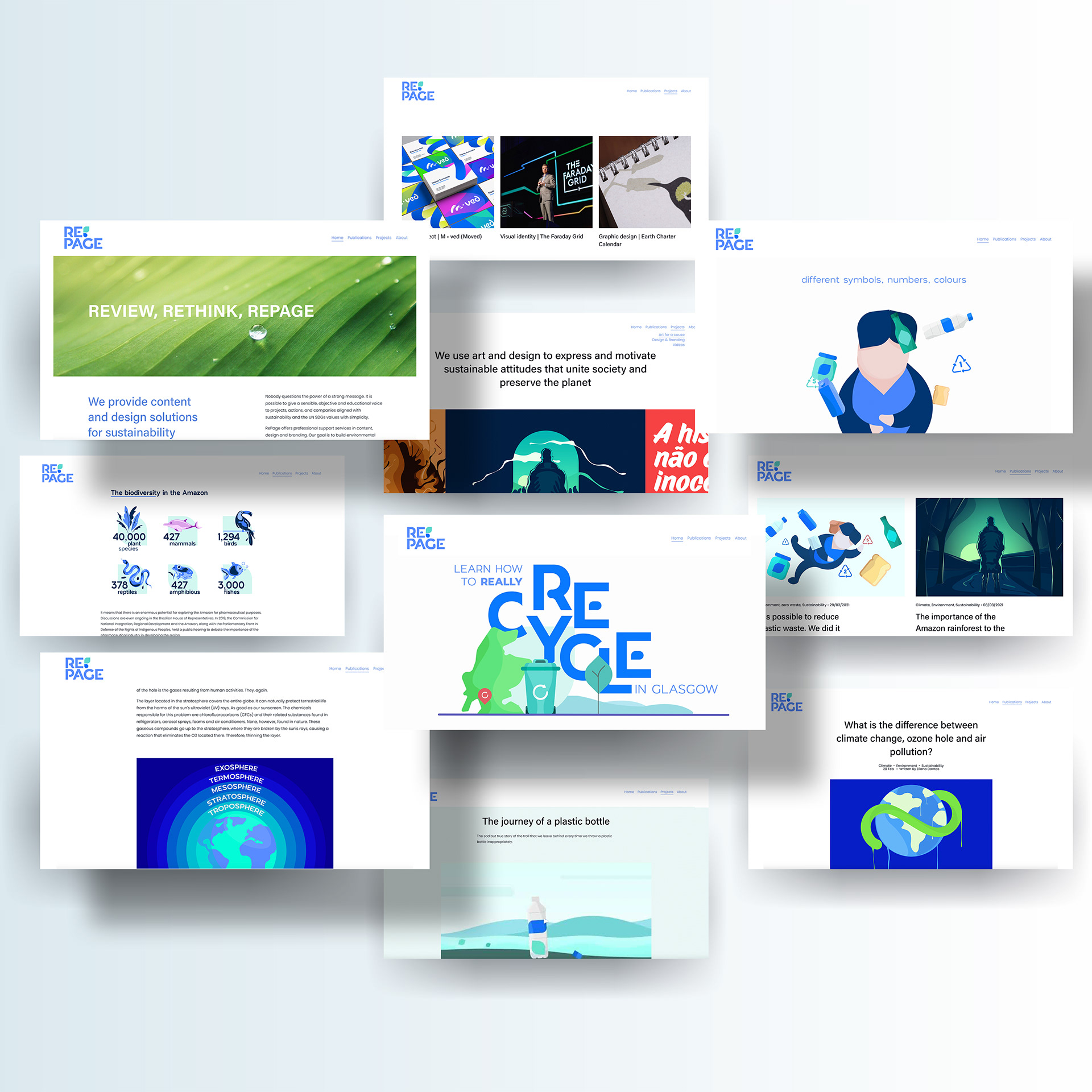
RePage is a personal brand I created for my design work targeted at sustainability. In partnership with many fiancees, who have masters in sustainable development, PR and communication, we aim to develop works on content, brand development and graphic design in sustainability markets.
The RePage identity supports the circular economy—the colours, graphics and typeface link to the green and the blue markets. The leaf and the water drop symbolise renewal and regeneration and establish the brand DNA that inspires the graphic development.

The creative services span written and design content, infographics, illustrations, stories, and graphic design, among other communication products.
Short animated films